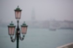
It’s almost a year since I discovered Martin Bailey’s incredible photography podcast and was inspired by him to put together a first top ten images of 2014. After a year exploring his 500+ diligently produced podcasts, time has rolled around. Putting together a 2015 top ten has been in my thoughts for a couple of weeks, and I thought I’d share it here along with a loud recommendation everyone who doesn’t conduct an annual review of their work considers it.
Really I can’t outline the reasons for doing so better than Martin’s post in which he shares his top ten and selection process. Rather than repeat what he already says so eloquently, I just wanted to log a few points here by way of personal footnote, before sharing the images themselves as much for personal reference and to crystalise the whole selection process in my head ready for another year’s shooting.
Firstly, I’d definitely suggest a single set of ten images across all of the genres you shoot. While I understand the argument for compiling a landscape selection, a wildlife selection and so forth, it misses out the real challenge and the real learnings. Chiefly I’d suggest that compiling a top ten within a genre isn’t that far different from what we do everyday as photographers. Typically we have multiple shots of most subjects, and we compare different expressions, angles, sharpnesses-of-eyes, etc. to come up with a best image within a set of “similars” to ultimately utilise. Selecting between similar images then, is something we all address as a pretty mundane activity then.
Making comparisons between genres is far more interesting, and far more challenging. For one thing it’s not mundane. It’s rare we’re called upon to choose between, say, a tilt-shift shot of otters at sunset and a strobist street portrait of a Parisian stranger. It’s much harder to approach and I find the typical, easy guidelines we might use to sift between similars melt away. The comparison of shots becomes about the basic essentials beneath the surface; do they evoke the mood, the scene, the emotion? Do they capture the imagination? Do they transport the viewer, do they connect? As we can’t make easy comparisons, we’re forced to consider and explore the more subjective and wild dimensions of our work, and that I find brings new insight onto what we did well and what we missed.
Secondly, both years I’ve found it a useful exercise in stepping back and pausing to consider intent, direction and the path ahead. This year Lightroom tells me I shot 7,853 images (not including the instant deletions). Of that I’ve so far “used” around 350 (across Flickr, Getty and family dispatches). In that mad rush of shooting, it’s hard really to take stock of where we’re up to and where we’re going. I’m not going to ramble about my personal learnings from that review here, but merely note that without this review – this quick check of the map, or recalibration – it’s easy to lose direction and start shooting without conscious intent or goal.
One final thought perhaps is that to me this process is about a harmonious set. These aren’t a ranked 1 to 10, rather a gallery that I hope balances and resonates together in a generally coherent way. There are some stranger portraits from the year, for instance, which I consider stronger shots that the final candid of Jessica dancing. With those substituted, however, the set somehow lacked the spark of life to lift it from a series of gathered images to a distinct whole in its own right.
In sharing mine top ten though, my main advice would be to check Martin’s post on the matter. His process is a thing of wonder, and it’s thoughtfully described in detail. Have an amazing New Year though, everyone, and safe travel to all!
Back in November I published my first “Inspiration from strangers” post showcasing street portrait photographers that inspire my own work. It features ten street photographers I hugely respect, with established bodies of works in the many tens to many hundreds of stranger portraits. Yet there was one photographer missing.
Carlo Sa is the exception. Away from Flickr for a while it took a little longer to get his positive response to my request to show his work. There are just seven images in his 100 Strangers portfolio on Flickr. They’re not neatly ordered in a set. Nor are they posted in order. Portrait 06 is missing, in fact. There are elements that some would challenge on technical grounds. And I’m totally in love with them.
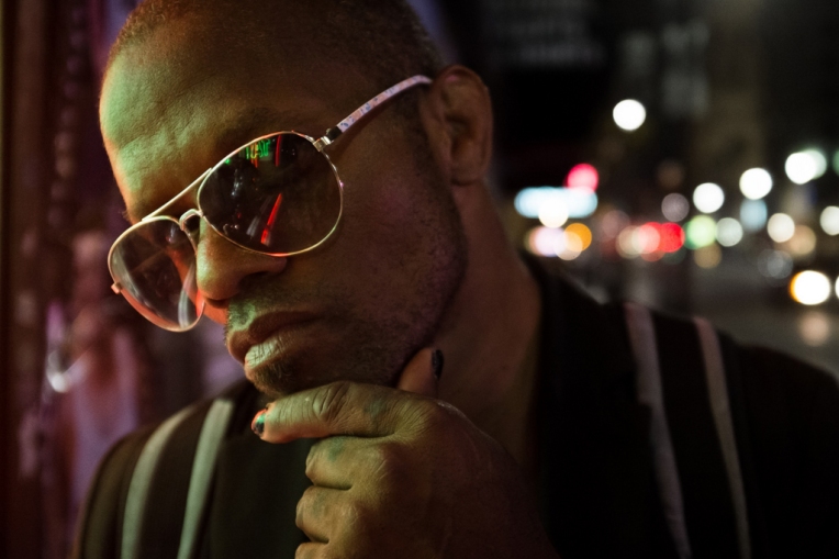
What they have is that urgent spark of visceral presence that so many – myself certainly included – over-process or over-think or otherwise suffocate. Portait 04 (above) was the first I came to. I love the bright, glossy reflection in his glasses. The weird, at once ultra-real and yet somehow fantasy play of light, especially the odd rim light on his right cheek.
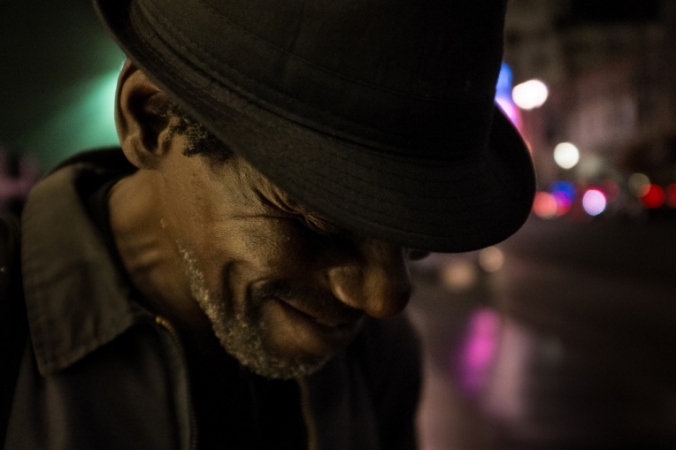
There’s the same feel of a sticky urban Californian night, and the same polluted wash of light in 03 (above). The same frisson of human contact. Portrait 02 (below) is a little more contrived, with more front, but the same fierce, dirty, real world lighting.
They’re risky portraits for me and packed with lessons I’m still working through for a future post, wanting to keep the focus here on Carlo’s work. In our email exchange Carlo noted a number of other portraits for his project and I can’t wait to see them. There’s a raw authenticity to them which I struggle to define, but know I don’t see elsewhere.
It’s a real skill balancing that sense of real life and intimacy. I really admire the details Carlo leaves in, and his use of found and borrowed light. The well judged elements of imperfection perfectly catch that random blaze of half met, half missed glances, the brief confrontations and flirtations, the energy of urban life, but hit with a little cinematic supercharge that lifts it above.
All images copyright Carlo Sa (2014), used with permission.
My daughter Jessica had asked for a camera to celebrate the arrival of her sister Sophie. As she said; “Sisters are special. Sisters can buy you ‘born gifts’. I would like a camera.” Being a soft touch, I complied and she’s making good use of a seemingly bombproof Nikon S33 – for example.
As she makes headway with that I’ve set myself the challenge of teaching her to shoot. Moleskine/Milk have a neat promotion to offer a free photo book to Getty Contributors, and I thought I would use my free credit to create a “how to take photographs” book for Jessica. In beginning the process of writing that book, I’ve been reminded of some of the reasons I shoot and – resonating with what I’ve taken from the inspirational David duChemin – have come to realise how much harder I could be pushing the envelope in terms of creative photography.
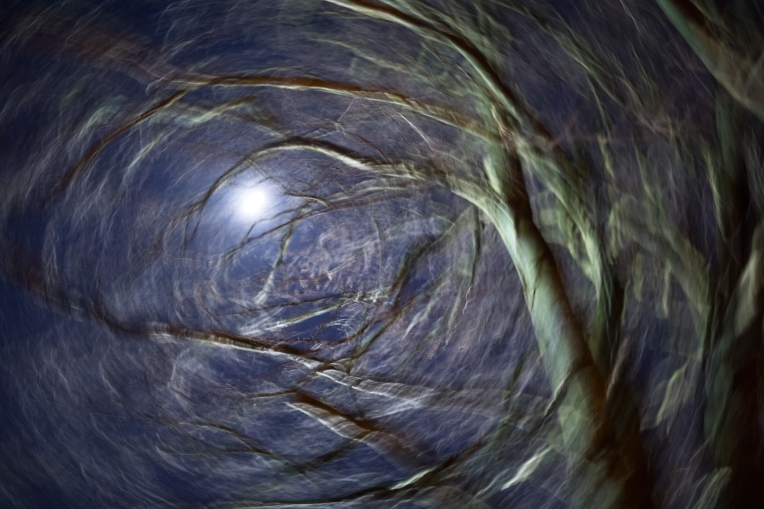
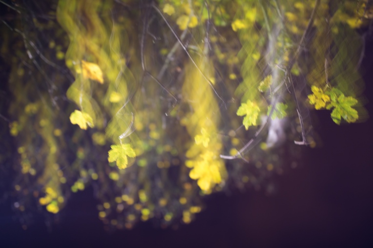
Full moon and late autumn trees, 2 second exposure, spiraling movement
Intentional camera movement has stood out to me as part of that for a couple of reasons.
For starters, it offers benefits in terms of being an initially low pressure style of photography that can be practiced in brief moments, and is possible at night, without significant kit, whilst offering an infinity of new subjects within even a minute’s walk from the house. I’m also enjoying the more poetic quest to shoot “how it feels” as outlined in this original post. And I’m also seeing how intentional camera movement or ICM resonates with the core principal of my photographic style.
Silver birch with mid-autumn leaves, 1.6 second exposure, jagged shake
More and more my literal photography is feeding my stock library at Getty Images. There you’ll find those shots I consider well taken, technically sound images of scene or objects that I found interesting or thought might be salable.
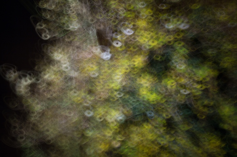
The kind of photography I consider “mine”, and the kind of photography I’m trying to teach Jessica, is based on the idea of making the mundane appear fantastical. So far that’s taken a couple of branches.
The first, and longest standing, is long exposure and light painting. Shots like the following where by compressing time and adding light one can take a dull night scene and conjure something a little more magical, something one step left of reality.
The second path is one of shooting street portraits of strangers, usually with a dash of adding light from a reflector or strobe or more, with the aim of taking an average person from the street and elevating them to a Vogue style icon.
ICM seems to offer another path on that journey – expressing an element of fantasy from everyday scenes, like the trees above, or from leaves on a pavement/sidewalk.
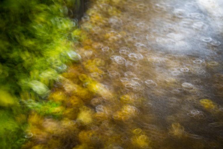
Mix of leaves on hedge and sidewalk in rain with reflected headlights, single second exposure, horizontal looping movementStreetlight on last leaves and white plastic bag caught in tree, 2 second exposure, held for a moment, then vertical drag and waving motion
Apple tree at night, single second exposure, tight, rapid loops
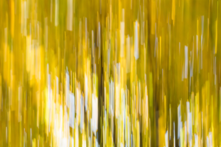
Slightly out of focus trees at sunset, 1/4 second exposure, slow vertical sweeping movement
Autumn beach leaves in sunlight, 1/5 second exposure, fast vertical sweep
Jessica’s first ICM shot, autumn trees in sunlight, 1/4 second exposure, 1/4 second exposure
When I first upgraded from my Canon EOS 300D to the 5D Mkii, one of the first things I had in mind to do was to sit down and set up the three custom shooting modes. In the end, they were a feature I barely used. Now, five or so years on, and a camera model later, I’ve finally found a use for them.
Unused street portrait background – Edinburgh
I should note that I typically shoot manual, with a single “one shot” AF focal point (joystick controlled, assigned to the shutter button). I have the automatic “preview” turned off, meaning I have to press the “play” button to view each image I take. All of this works extremely well for me when actually shooting portraits. I find it best for control, for the appearance of control and for battery conservation.
However, before I can get to shooting those strangers I have to find a background. And for doing that, my standard settings are a nightmare.
You see, when shooting strangers for my 100 Stranger Project, increasingly at night, I’m walking around with a light stand and shoot through umbrella in one hand, with a reflector or two tucked under it, and the camera in the other. I can shoot one handed, with the camera on a black rapid strap, pre-focusing it on the ground, but if I recompose it’s too easy to refocus on the background and have to “reset” it by pointing at the floor again. Moreover, with only one arm, it’s a nightmare to preview the background, juggling kit to get a straining finger tip to the preview button.
Another unused street portrait background – Edinburgh
On a recent trip to Northern Ireland, I finally got around to testing custom shooting modes for this, and it works fantastically. I now have my manual mode set up for my favoured settings – “one shot” AF, no preview, etc. C2, however, is set up with my usual night exposure settings with my portrait lens, the 100mm f/2.8 L IS macro (f/3.2, 1/50, ISO 1600), with automatic preview on, with focusing moved to the back button and deactivated on the shutter button.
It sounds like a small thing, but it’s transformed my night portraits. I can now whistle around freely, at pace, casually shooting and testing backgrounds whereas before I would decide not to test some on account of the juggling act of gear. I guess we sometimes build up the custom shooting modes in significance – decide they should have some very important task or emergency application – but what I’m finding is that in fact small, apparently trivial tweaks like this are delivering massively and making my photography more enjoyable again.
Some eight months after buying the Canon 35mm f/2.0 IS lens, I’ve sold it to upgrade to the new Canon 35mm f/1.4L ii. In many ways, it’s with some regret. The f/2.0 IS served well on the whole. I’d bought it primarily to shoot submissions for my Getty Images stock library; a nicely portable lens that could shoot a variety of subjects, in low light when needed, with the ability to blur away the more distracting elements of an unwanted background. Over the eight months I used it, shots like these made their way into my Getty gallery.
Canon 35mm f/2.0 IS – Smoke Without FireCanon 35mm f/2.0 IS – HazardCanon 35mm f/2.0 IS – Rain Without SkyCanon 35mm f/2.0 IS – Hard Light & Water
For all the successful shots, however, the Canon 35mm f/2.0 IS has a significant weakness; the quality of the corner bokeh. Especially exposed when shooting close up with a wide aperture for a shallow depth of field, the corners can take on a weird geometric pattern. Giving images the sense that they’d been poorly photoshopped, and incredibly hard to remove, the effect was something I could not live with. Here are some examples;
Canon 35mm f/2.0 IS – Strobist cow parsley. Geometric pattern widespread in top corners.Canon 35mm f/2.0 IS – Girl picking blueberries. Geometric pattern evident in top corners especially.Canon 35mm f/2.0 IS – Girl picking blueberries. Geometric pattern widespread.Canon 35mm f/2.0 IS – Girl at Kimmeridge. Geometric pattern evident on cliff’s behind girl’s head, and through waves/rocks on left.Canon 35mm f/2.0 IS – Girl running in Paris fountains. Geometric pattern evident in buildings, especially far left.
Whilst more or less apparent from image to image, in some cases the strength of the pattern was such that the image was essentially unusable for commercial purposes. When the new Canon 35mm f/1.4L ii was launched then, my first question was whether this issue would be fixed. Most articles compare the old and new f/1.4, or compare the new Canon f/1.4L with the Sigma 35mm f/1.4 ART lens. For those f/2.0 IS users experiencing similar issues as those I faced, I hope the following images from the new 1.4 ii help inform their thoughts on a potential upgrade.
The short story is that I have yet to see this issue with the new L lens. Here are some examples, shot as tests rather than portfolio pieces. Many were shot on the evening the lens was first delivered, at night and therefore ISO 1600. As such I would not use these as examples for sharpness necessarily.
Canon 35mm f/1.4 L ii – Test shotCanon 35mm f/1.4 L ii – Test shotCanon 35mm f/1.4 L ii – Test shotCanon 35mm f/1.4 L ii – Test shotCanon 35mm f/1.4 L ii – Test shot
More to follow as I continue to shoot with the new lens.
As I approach the final portrait in my 100 Strangers street portrait project, I’ve been reflecting on the photographers that inspired me to start and continue that journey. Some of them proved elusive, but ten of them kindly agree to let me share their street portraits here with a few words as to what I enjoyed in their portait work, and how it inspired my photography.
Perhaps the biggest spur to shoot strangers at all was Gerald Emming’s incredible 30 second project. Seeing Gerald’s work for the first time I could not quite believe this was possible on the street – everything was so clean, pure, intense. The stark, desaturated sheen and bold, intimate crop gave the series an unmistakable look, so consistently delivered time and time again. This one especially stands out in showcasing what struck me:
A Stranger – Groningen by Gerald Emming
Gerald’s work is maybe most appealing to me in that it establishes such an instantly recognisable look, that he’s able to play with it in a number of portraits, introducing candid moments or twists on the style – without distracting from the core. This next one is perhaps my favourite of those, catching a chance, candid expression within the shoot. It’s that mix that strikes me in how I try to shoot my work. Striving for the consistent, recognisable look, whilst accommodating the opportunities each individual presents, and threading them together like alchemy into a magical whole.
Heading over to the 100 Strangers group on Flickr I found Peter’s work. Of many incredible shots, there are two I particularly admire. The first of Elle I’ve returned to a number of times, in awe of the wild light. When shooting Lily #69/100 in tough lighting conditions, it’s exactly this portrait of Peter’s that I thought of in trying to harness the wayward sun. I like the genius economy of the lighting – a single tilt of a reflector in the sun at once adding drama to her expression, depth and texture to her dress, tone to her hair and emphasis to the wall behind.
Stranger #229 – Elle by Peter Grifoni
Compared with the pure drama of Elle’s portrait, there’s an intimate narrative almost to this one of Avalon. I’m as guilty as many others for getting lost in the compressed, tight headshot. For all their power, they sometimes lack that hint of environmental intrigue, of story. I love way all that plays out in Peter’s portrait of Avalon. Despite the consistent crop of head/shoulders, the wider angle lens brings so much more to life around her. Wider angle backgrounds can be so hard to compose to prevent distraction, and I love how Peter uses the chair on the left and the partition on the right to create a kind of “lead in step” effect in harmony with the centred composition. With all that going on that pure, smooth light and engaging mix of flirtation and ambiguity in Avalon’s expression is sorcery itself.
Tim shoots all kinds of incredible characters. There’s an amazingly raw character to his portraits of Melvin and Eddie, yet it’s one of his diptychs that I especially admire. Perhaps its the way the two shots both echo and inform one another. The power of class and character to Stefan’s headshot on the left is kind of at odds with the shorter looking, quirkier character of the environmental portrait on the right. Yet it occured to me that this is the beauty of what we do – so many of those people we pass, the quirky, the mundane, all of them – have this same inner core if you only stop and speak and look for it. This shot became kind of touchstone for me in that regard. A reminder that sometimes we should ignore the cover and take a proper look at the book.
Jeff’s work over at the 100 Strangers and more recently at The Human Family always struck me for his variety of subjects. Even writing that note on looking beneath a person’s superficial appearance alongside Tim’s work above, I have to admit I often end up shooting with the obvious “strangers of interest”; the Vogue/Glamour-definition young and beautiful. Jeff has an incredible talent for seeing and expressing that beauty in a huge range of subjects.
784/800 – Elizabeth by Jeff Bowen
This one of Iman particularly struck me – the skillful technique in difficult light, the beauty of character, the balance of foreground and background and that masterfully judged depth of field retaining a sense of the world whilst ensure even cluttered lights supported Iman, rather than distracting from her. There’s a magic to shooting in the night which is so well communicated here.
Meeting Colin at my Stranger #5 was an important moment in my project. It’s what turned it from a solo endeavour to a social project, through which I’ve met a whole legion of fantastic photographers. As well as his advice, wry humour, and willingness to pose (generally stooping a foot or so down to simulate a typical subject’s more diminutive frame), his tight headshots especially grabbed my attention.
Stranger #27: Ines by Colin Strain
Ines flirtatious smirk and billiowing hair, and Tiger Lily’s smooth gaze with spiked shoulders are so powerful against that deftly dropped background, and they’re just two of a whole legion of thoughtfully approach, skillfully shot strangers I’d encourage you to check out.
Peter’s another 100 Strangers photographer I’ve been lucky enough to shoot with a couple of times now, and a 500 miles per hour dynamo with it. He’s another who’s diptych in particular inspire me. This one of Thamanay for instance, which comes with a kind of movement to it – a sense of meeting at a distance, and then a sudden, more intense turn in events.
89/100 Thamanay by Peter McConnochie
This one of Anna is great too, offering a different contrast. He shoots fantastic portrait format shots especially – people like Abigail or Emily. More than anyone else, Peter’s portfolio buzzes with an energy of encounters. I love the moments when he’ll zap in a shot of strangers tattoo as well as their portrait. That eclectic mix of street fashion, photo journalism, energetic documentation and fast paced encounter is so full throttle and constantly flexible.
For every posted portrait, we all endure unseen hours on the streets. Often this is not so much due to rejection, as due to an absence of that perfect stranger to match a background we have seen. When a stranger does appear, that echoes, enhances and lifts a background it’s like rocket dust at Christmas, and this shot of Barbara’s is perhaps the most perfect instance of stranger meeting perfect background. Such an incredible mix of vision, patience and execution with so much on the line.
#90 — Courtney by Barbara Asboth
Then there’s the artistry of this one – where the match of stranger and background is less dramatic, less obviously perfect, yet still so evocative. Perhaps more so even, with the beautiful balance of costume, style, tone set and expression.
Josie [Stranger 102 / 200] Covent Garden, London by Barbara Asboth
Arnab’s willingness to experiment and seize left field opportunities is perhaps the thing I most wanted to feature here, but I’d first kick off with this “straight” shot to establish his credentials in a more traditional sense. Super direct headshot. Cool.
Stranger 92/100 – Hannah by Arnab Ghosal
For me, though, Arnab is the guy who hung out at the National Theatre to buy a stranger a glass of red wine, and shot her posing indoors whilst he was outside in the rain. True story. Sometimes you can see the edges of those experiments, and sometimes he just blows you away – like with this one of Jesse. I’d definitely check out the description behind the link for the story and thought process – awesome. The result with that clean palette of whites and the nuanced balance of diagonals is epic, held together with Jesse’s super gaze.
It’s a big regret that I missed Sylvia on her recent(ish) trip to London. Of her incredible portfolio, the following two shots grabbed my attention for the way she harnesses natural light so skillfully. When you read the detail of that first portrait of Jazmyn and see it’s all achieved with a single small reflector, it makes me feel like a proper plonker carrying lighting gear around with me. The hazy gold of the distant pillar, the way it infuses the edges of Jazmyn’s incredible mane of hair, and then that smooth even pop from the reflector are all so perfect. The depth of field is so cool too – getting those diagonal highlights sweeping back into the centre of the frame.
100 Strangers – Jazmyn – 116 by Sylvia Cavanagh
Another amazing reflector shot below, but this time with a superbly matched tonal theme and a totally different background effect, speaks to Sylvia’s flexibility. This time I love how the reflector changes the tone set up, introducing that warm glow to complement the pale, smokey blues.
There’s such a raw drama to Davide’s (w@@t) portraits. I’m a big advocate of the idea that “no one cares it’s a stranger”. By which I mean that when approaching a street portrait, the viewer is judging your portrait just as if it were a portrait of a model or family member. Maybe when they read the story behind the image they care, but when they first see it, no one knows. It’s just a portrait, fighting for attention against all portraits. You’d think you’re at a disadvantage then – shooting random strangers, compared to shooting professional models – but when the situation is handled well, you have an edge. There’s a spark to street encounters that one does not necessarily find in model shots. A certain frisson. Davide’s a master of harnessing that spark.
Stranger 28/100 – Cristiano by Davide Viti
In these two shots that harnessed spark shines through. The almost feminine expression of Cristiano, with his quirky angled glasses, and the swish of hair framing that femme fatale gaze of Lera. I’d love to shoot with Davide and see him working with his subjects – inspiring these moments. Hopefully we’ll get to hook up in the New Year!
Stranger 76/100 – Lera by Davide Viti
Please note, all images are copyright of the linked photographers.
Listening to recent reviews and discussion around the Canon 5DS, 5DSR and the Leica Q you find some comment around in camera cropping options; features that let you set different crops or effective focal lengths in camera. Likewise, there’s a note to some 5DS and 5DSR reviews that with so many pixels, one can crop in post and still have decent size files. Of course, in all these cases you’re losing pixels and image size, and that’s the main focus of debate I encounter.
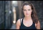
One nuance I don’t see mentioned so much is the difference in depth of field between a shot “cropped” with a camera feature or in post, versus a shot “cropped” by recomposing, moving nearer your subject. My street portrait of Czech girl Jitka hopefully serves to illustrate the difference here.
Above is the main shot from last year’s street encounter with Jitka. As well as this shot, I took another closer cropped version stepping nearer her (see below). Depth of field, obviously, is an equation with multiple facets – the width of aperture, the focal length of the lens, but also the distance from sensor to subject, and from subject to background. Composing more tightly, a closer crop, by stepping near your subject changes an input in that equation – by getting you nearer your subject, it gives a shallower depth of field, as many people seek in a portrait. It has a three dimensional impact on your composition.
Cropping with a camera feature or in post has only a two dimensional impact on your composition. It doesn’t change your depth of field, or help to drop a background. Here’s an example to illustrate. The first image (left/top) is a Lightroom crop of the main image above. The second image (right/bottom) is a separate image shot by stepping closer to Jitka – helping to drop the background further out of focus.
As ever it depends what you’re shooting and what effect you are seeking. If you are shooting landscapes, seeking front to back sharpness, this nuance probably needn’t enter your considerations and the loss of file size is maybe the biggest trade off to consider. For those shooting shallow depth of field portraits, I think it’s a valid footnote to the discussion about the advantages of these new features or pixel counts.
Sometimes the advice against cropping with a camera setting or in Photoshop is overwhelmed by “purists” who simply object on ethical grounds. That’s a shame, as it disguises some of the tangible effects these decisions have on our images. I’m a pragmatist, I don’t care how I get the end image. Often that’s best done in camera, and hopefully this quick examination highlights one of the situations where that’s definitely the case!
As I draft a couple of posts of tips for taking better street portraits, I’m reviewing my portfolio. Among the portraits are scattered, however, the various near misses that are the backgrounds that never found their stranger.
Above, thick fog diffuses the soft winter light, whilst fresh snow acts as a natural reflector. Last night’s blizzard has turned The Mall into a giant light tent, with a vanishing point arch of stately trees running through it, but no one is around to ask…
One of the main divides I encounter speaking with others who shoot street portraits are those who advocate a stranger led approach, and those who advocate a background led approach. I’m generally the latter, for reasons I’ll sketch in coming posts, and so my shots generally start as a stage. The actors, however, don’t always show on cue. Sometimes time simply runs out, and you simply have to walk away, leaving these relics behind on the CF card – test shots to nail down settings, compose, prepare, all for naught. I thought I’d share what that sometimes looks like.
You hear the phrase “getting it right in camera” a lot, but I don’t think people think through what that means. If you’re shooting on a digital camera, “getting it right in camera” is a misnomer nowadays. There’s lots of good resources that advise one “exposes for the right” to get the cleanest, most tonally rich images. It’s just the way our camera’s sensors work – right up to the point we blow our highlights, we’re capturing richer and richer information. Check out Martin Bailey’s excellent podcast on exposing for the right if you’d like the full story!
That’s not exactly what I’m talking about here, but I wanted to kick off this post on editing portraits with that thought, because it’s kind of important in change our mindsets with regards processing. In a world of digital sensors, getting it right in camera means shooting an image that will look overexposed unless we process it. This realisation reinforced for me the notion that photography is a process that starts and ends a good distance either side of the camera. We should shoot to get the best data, given that we should then process to get the best image.
As you’ll see here with this set of before/after images from my 100 Strangers Project, whilst striving for the best data in camera I make plenty of mistakes. It’s a learning project, after all. I wanted to share here my process for editing my street portraits – partly for self reference as I look to improve, but chiefly thanks to the many questions I get through Flickr with regards the work I do.
In editing these shots then, I use two tools; first Lightroom for 80% of the work and 20% of the time, then Photoshop for 20% of the work and 80% of the time.
My Lightroom workflow starts along very similar lines;
– Boost sharpening to ~40/60, but push the masking slider up to >95.
– Boost vibrance by 10/20.
– Boost shadows by 20/40, chiefly determined by the subjects hair, which I want to keep looking natural.
– Turn the Chromatic Aberration correction on, with +1 in both fields, maybe more. My 100mm L Macro lens is lovely for portraits, but can show some green/turquoise edging at wide apertures (I shoot at f/3.2 for these portraits).
– Tweak white balance, generally I warm images very slightly, or use the pipette on the whites of the subject’s eyes to test an extreme option.
Next I grab the Lightroom brush tool for a few separate operations;
– Take a -10/25 shadow brush and burn the deeper shadows, especially around the hair and neck, and collars.
– Zap the whites of the eyes with -20/40 saturation, +4/8 shadows and +.1 exposure.
– Paint in the iris, opposite the main catchlight, using a +.6 exposure brush, sometimes with a clarity and/or saturation boost. Initially I was painting much more of the iris, but a fantastic Dani Diamond article on Fstoppers showed how light enters and leaves the eye. Working on the opposite side of the iris from the main catchlight gives lots more drama.
– Darken the upper portion of the eye very slightly; -.1 exposure. For these operations I usually find it easier to paint them in, straying over edges, then hold down Alt to clean up with much more accuracy.
– Emphasise a few key areas of brighter hair, sweeping along key lines with a +20 highlight, +20 clarity brush.
– Give clothing a little contrast boost, and maybe emphasise key highlights and shadows with a similar brush to my hair above. Glasses will generally get a clarity boost on the rims.
– Unwanted highlights, especially in glasses generally get a -10/20 highlight brush at this point.
Finally, I might add a gradient filter to add -100 clarity or -.2 exposure to one side or other, starting well out of the frame and avoiding the subject. That’s usually us finished in Lightroom. I never crop yet, as I will sometimes borrow small elements from other frames and prefer to keep things in the broad scale and composition until after that stage.
Now we’re off to Photoshop. Whilst I use Lightroom to make non-destructive, pretty consistent edits, in Photoshop I’ll immediately create some spare layers and make permanent changes.
I start work with small corrections to the subject; fiddly things I want to get out of the way first. I chiefly use the “patch” tool. I’m not sure why it doesn’t get more love! I see/hear lots of people using spot healing tools, yet I struggle to preserve skin texture with them. The patch tool is a little slower – I zoom right in to near pixel level to correct temporary skin blemishes/spots, dust spots on clothes and some (not all) stray hairs. However, for the extra time, I find a much more consistent grain and texture to the corrections, especially the skin. Occasionally, I’ll use the “fade” follow up command to blend in patched corrections, but again that’s rare as it undermines the consistent skin texture. If I’m going have to make changes to texture, I want to do them globally to a face – or you end up with blemishes replaced with excessively smooth patches which looks stranger sometimes.
When making those more global changes I have a couple of techniques. My go to method is the brush tool, using a technique from the incredible Aaron Nace at Phlearn. I’m always doing this after patching. Then I will take a large, soft edged brush at 5% opacity and paint over the face, constantly sampling and repainting with tones from the pipette. I will try to keep using shadow tones around shadow areas, etc., but will be painting heavily over and over areas. I’ll then add a layer mask and ensure the eyes and edges of the face are cleaned with a 100% black brush, then areas of contrast around the nose, eyebrows, lips, etc. are cleaned with a minimum 50% opacity black brush. I’ll pull that whole layer back to 30/50% opacity – usually at the lower end.
If I’m still not happy, I will add another layer at 50% opacity and redo all the patching a second time. If things are really desperate (only once in 89 strangers) I’ll use frequency separation. Again, the best explanation and free action for frequency separation are from Phlearn, and worth checking out here. It’s really rare I use it – as I find the patch technique, along with a little time and patience, is the most realistic approach and works for my look!
Before moving out from the face I’ll use the patch tool to clean up any red streaks in the sclera (whites of eyes), and to de-dust/scratch glasses. If there are big reflections in the glasses, I will try to patch them which usually works until the reflections hit the edges. If I’ve failed to avoid this when shooting, then I will copy the other side of the glasses, paste it, flip it horizontally and use this mirror image to provide source pixels to rebuild the affected edges. It’s slow, but strangely soothing and generally gives a good result.
Hair is edited mostly with the patch tool in tiny sections (3-5 pixels sometimes) to remove hairs that stray into eyes, or run perpendicular to the main flow. Sometimes I will using the clone stamp here, in one of the scattered brush shapes, just a few pixels across, to blend the flow of messy strands. Sometimes I will draw a few extra hairs in with the paint brush, adding them to a separate layer and adding a blur in a rainbow shape across the top so as to blend them better into my shallow DOF.
Finally I look wider than the face, tidying up any major issues in the background. I’m increasingly shooting with my lights (usually an umbrella and reflector) very close to my subject and that means they often sneak into a corner. I’ll use contact aware fill for the main area at issue, and then the patch tool to clean up the edges of the filled selection. Very occasionally I will add a little extra blur to the background, masking out my stranger, and then add a 0.5/1% noise to the same area.
There are a handful of strangers where I’ve borrowed a shoulder. eye, collar, top of head, etc. from another shot of them and composited – maybe to get the best shoulder pose with the sharp eyes or similar. I’ll handle that elsewhere. My project is 100% not a photojournalists project! I am trying to make realistic, but Vogue-style portraits. The final piece to that puzzle is some minor toning. I add a curves layer and boost blue and green in the shadows (usually 3:1 in favour of blue), and occasionally boost yellow in the highlights – but never when the background is bright. It gives a slightly more fashion tone set, to my eye.
Hopefully this set of before/after shots gives an illustration of the impact of the process. Sometimes it can be quite major, sometimes pretty invisible. In some the examples shown I’m using an adjacent frame for the “before” just to avoid losing editing data in Lightroom, but in all cases the camera settings are identical and the shots are taken milliseconds apart. I really hope they answer the questions I get on Flickr and map out my work flow and the typical actions I take to get my look. I’m not saying this is the best way, or the most efficient way, of course. I grew up in Photoshop 7.0, and am massively over manual in my use of the tool. However, I find the painstaking approach useful in getting to know an image, testing and reviewing it, before posting. Hopefully the overview is of interest and offers a few tips or ideas! Have an amazing week!


, Rickmansworth Aquadrome")
, Bohinj Jezero")
, Logarska Dolina Slovenia")


, London Shoreditch")
, London Noho")
, London Carnaby Street")
, NYC JFK Terminal 2")
, Stockholm")
, Seattle Pike Place")


![Josie [Stranger 102 / 200] Covent Garden, London by Barbara Asboth](https://flatworldsedgephotography.com/wp-content/uploads/2015/11/street-portrait-barbara-asboth-josie.jpg?w=660&h=439)